Sometimes the most simple dinners are truly the best dinners…
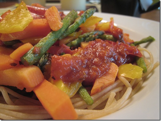
Tonight I made Vegetable whole wheat spaghetti and boy was it delicious!
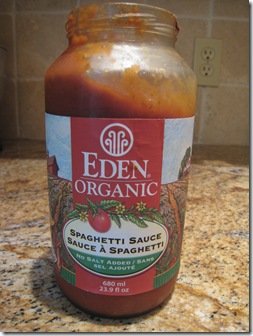
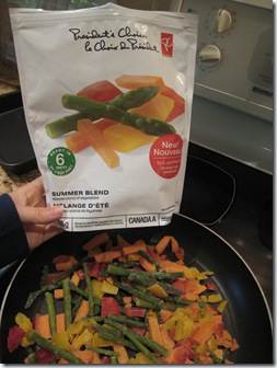
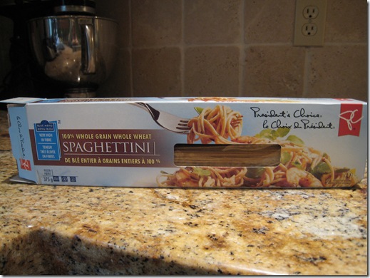
The products included Eden Organic Salt-Free Pasta Sauce, PC Frozen Veggie mix, and PC Whole Wheat Spaghetti:
It was a lovely meal!
I had a side of a PC flatbread bun (toasted) with 1/2 an avocado:
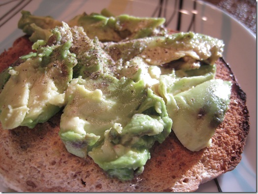
YUM
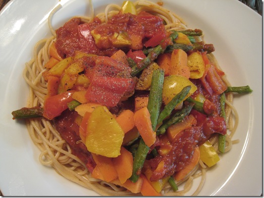
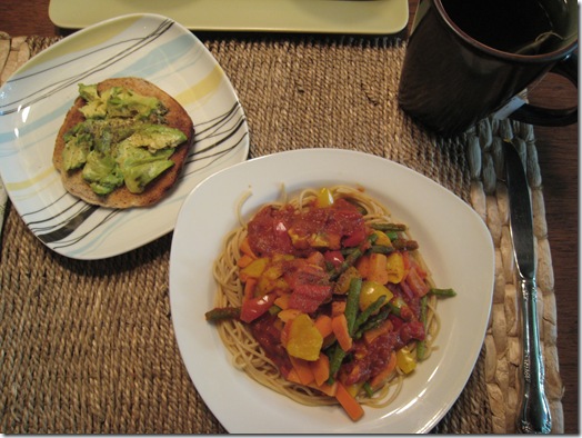
The whole she-bang:
Dessert was one of these addicting lil guys! :D
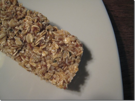
Mmmm…nothing beats it! :D
 My workout today was quick and to the point! I was super busy today so I had to be efficient!
The workout:
- Duration: 35 mins
- Treadmill hill walking, speed 4.0 mph incline 15%
- Max heart rate: 169 bpm
- Avg heart rate: 157 bpm
- Distance: 2.3 miles approx.
I was prepping for my interview today so my mind was occupied. :)
No strength today- I am resting my muscles! :)
You know what’s kinda sad? I am MISSING the BBBC! *sniff, sniff… :(
![]() 1. RE: Oh She Glows new logo!
1. RE: Oh She Glows new logo!
I’ve had a couple questions about the logo, so I wanted to do a quick poll on it!
I thought Zesty’s idea of the ‘G’ coming through from the O and the S was pretty cool! I didn’t even see it myself at first glance, but Eric saw it right away! Maybe it is a guy thing! :) I was like ‘ohhhhhh there’s the G!!!"’ lol.
Ok, go back and take a look at it- Do you see the lowercase G now? :D
2. Don’t forget to enter my Hip T contest! It ends tomorrow!
3. If you participated in the BBBC and you want a chance to win the Glo Bakery Prize package, please email me your results! ohsheglows at gmail.com
4. Are you looking for a quick way to print my recipes? Keep your eyes peeled for a new easy PRINT button courtesy of Eric (resident techie genius!!). He has been hard at work for a couple of nights getting this put together! I can’t wait to try this bad boy out! :D
5. I am hoping to be able to sell my Glo Bakery goodies at the upcoming race on June 14th. The only snag? A hefty vendor fee! :( I will keep you updated on the situation! I have decided that all of my profits will go to my charity for the Canadian Cancer Society- woot woot! I just hope I don’t have to pay a large fee because that money could be going to the charity, ya know? So if I can’t get the fee reduced I won’t be able to participate. :( I may look into simply donating some goods for the runner’s bags, but I will have to see. I’m hoping for good news tomorrow…
6. My media interview today went well! I hope to be able to show you something quite exciting IN PRINT this November 2009! :)
7. Shop 4 A Cause is scheduled for Thursday June 11th, 2009! mark your calendars!
8. Thank you for all of your amazing and thoughtful comments in today’s hot topic post!
Ok, I am off to work on my OSG and GB FLYERs- man it never ends! :) Eric and I are also going to squeeze in a walk- it’s beautiful out.
Canada’s Next Top Model is on TV tonight! Can’t miss that… haha. My weekly guilty pleasure…
Have a lovely evening whatever you may be doing- ENJOY IT! :)


Your dinner looks delicious! I absolutely love veggies with tomato sauce.
By the way, I’m sort of a new reader, and fell upon your recipe for the green monster pancakes. I’m in awe. haha…I can’t *wait* to make them. Thanks for sharing some great ideas! :D
Your dinner looks out of this world amazing!!!!!!!!!!!!!!!!!!!!!!!!!!!!!!!!!!!! so good!
I only saw the “g” once you said it was lower case. I was looking for a “G” that matched the upper case one! Maybe some how outline or shadow the “g” to make it stand out more?
My blender bit the dust…I am having green monster withdrawals! I must buy a new one this weekend!
I love dinners like that – quick and easy :)
Hi –
let me preface by saying, I’m a graphhic designer, so, kind of a nerd about these things… But, because the logotype and logomark are in the same font, it’s especially hard to see the “g” in the mark because people would be looking for the upper case G as it is in the logotype. You have all upper case, and then want people to see the lower case g. That is asking a lot of an audience. Hope that helps – love this site!
Dinner looks delicious!
Veggie spaghetti is the best!
It took me a little bit to see the “g”. I think making the letters the same color might help? Or making the “o” and “s” the same color and the “g” a different color…I like it the way it is, but just in case you want to make it more visible!
Thank you for all of your suggestions! Eric and I agree that it is too hard to see the G- rest assured that we will be working hard on some modifications! I will likely produce a few variations and then have a vote! Stay tuned!! ~A