Good afternoon!
I have been busy as a been bea bee this morning. There are lots of fun things going on with Glo Bakery and Oh She Glows right now. It is quite hard to keep up!
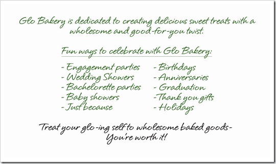
Last night Eric and I worked on the design of the Glo Bakery business cards! Thanks to all of your fabulous tips, we decided to download the template and design the card from scratch in Photoshop. This was not an easy task! After pulling out our hair for several hours until past midnight, we finally came up with a 1st draft.This now explains why there was no typical nightly post last night!
Front:
Note: I removed my last name and contact information just for safety purposes.
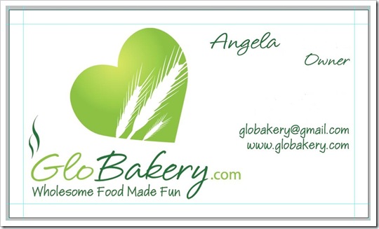
Back:
Fast forward to this morning.
I have been working on the Glo Bakery logo (shown above) to try to make it ‘pop’ off the page a bit more. Cue Adobe Photoshop once again. I am finally getting pretty decent at using Photoshop. Slowly but surely I am understanding the layers and all the different functions!
New logo draft 3:
I like this revised logo, but I am not sold on how it looks on the Glo Bakery header:
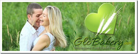
It doesn’t pop off the page enough. I need to still figure out a way to make it more visible. Any ideas/thoughts?
I will likely be updating the new revised logo onto the business cards too. I like the look of the word art! :)
I am also working on a logo for Oh She Glows with the wonderful Zesty! Lots of exciting things going on. :)
I haven’t gotten my workout in yet, but I did update the BBBC Challenge for today as well as my workout log on the Run page. Progress, right??
Now I am off to the kitchen to create another order– stay tuned tonight for pictures! I will also be showing you the results of making Glo Bars in my new candy bar molds. Find out tonight if it worked!
After I create my order I will be doing my exercise for the day. It is super beautiful outside today with expected highs around 13C. I might get outside for a walk/run- first of the year. We will see though. I am a bit nervous about what the nasty pavement might to to my joints post-injury.
Also on today’s and tomorrow’s to-do list:
- Paper (E?) work for OSG and Glo Bakery
- Update my spreadsheets
- Input receipts
- Research GST information
- Get back to my brother in law about tax stuff
- Research kitchen organization/storage solutions
- Study Food Safety Manual
- Create price list
The not so glamorous side of running a business!
Have a great hump-day!! :)
Unless a man undertakes more than he possibly can do, he will never do all that he can.
– Henry Drummond
What if you do a little Photoshop work to the header itself. Maybe mute the greens of the grass, blurring the lines slightly. That might make your logo pop more.
Your graphics look awesome! No suggestions/the look perfect as they are!
I think if you include some other color (other than diff shades of green) will help bring out the logo more … maybe light brown/’wheat’ colored font?
i love the logo!
maybe you could soften the green in the picture of you and Eric in the header, so the green logo would pop more?
OR make the logo on the header a white heart with green wheat instead of the other way around? That way, it’s the same logo just with the colors switched.
Hi there!
Recent reader of your blog here! I love your site and the positive and uplifting message you continue to promote! :)
Some small ideas on the logo (I have a minor design background). I love it and think it looks great (awesome job!). But I find that my eye is being distracted by the squiggly lines above the word “Glo.” Perhaps remove it? Then the eye will immediately be drawn to that cute heart/wheat graphic. And Cecilia’s idea to make the font a light golden wheat color is a great idea. Maybe give it a try with the company name only and leave the tag line the green color?
Other than that, I really like the logo and think you have a knack for this!
Good luck! :)
How about flipping the colors on the Glo Bakery header?
Make the heart white, the grain green, and the text white too. :O
I think that’d bring it out! But I personally think it looks nice the way it is. :P It stands out to me.
I absolutely adore your logo, btw. It’s freakin’ awesome.
Bachelorette Parties is spelt wrong on your business cards
I agree about the squigglies – they distract me, too!
What if you keep your logo with the same colors it is now, and change the picture of you and Eric to black and white? That way you still have all the same components, but the logo will pop more
I like someones suggestion of switching the green and white of the heart and wheat. I also think you should try putting a small white stroke around the text, between 1-3, depends on the size of your font!
Looks great!
Thanks Sam, now fixed :)
First off whoever “lol” is, is a complete loser with nothing better to do! Seriously, get a life, or a job!
Moving on….
I think if you outline the heart in white, and then outline the font in white too, that may help.
Possibly using an alternate pic as the background, or changing it to balck an white is a good idea I think.
:) Looks great!!!!
There’s a lot of texturizing you can do with photoshop that wouldn’t require switching your colors on your logo. Also, I can help you set up an email address thats [email protected] instead of the gmail one! Let me know if you’d like help, I get bored a lot, and my fiance is working late tonight!
for the header, maybe make the heart white? for popping purposes, just a thought.
so cute though!
Maybe you could add some white aura around the green heart so it looks like it’s “glowing” it would blend more. Also, in the Glo Bakery logo you could replace the dark green color with white to make everything tie together better. Good luck!
Awesome logo. Maybe if the picture wasn’t also green it would stand out more? And maybe you should have a picture of food rather than a picture of you. It’s a beautiful pic of you and Eric, but it is a bakery so maybe one of your yummy products would be more enticing to potential buyers?
I looked at it again and you should also do a lower case “s” on Wedding Showers since you only capitalized the first word on everything else.
That heart needs to be a different color! I’m sorry to say it … I like that it’s a green heart on your logo, but with that background of you two in the field – its washed right out. Tough decisions.
I think a picture with YOU and your food would be the BEST for a background :)
The more I look at it – it’s you and Eric that are “popping” off the page – NOT the logo.